Central Limit Theorem
The Central Limit Theorem (CLT) is one of the most important results in all of statistics. It explains why so many statistical procedures, t-tests, confidence intervals, ANOVA, can rely on a normal approximation even when the underlying data are not normal at all, as long as you are looking at a sum or an average of many observations, not at individual observations themselves.
What the theorem actually says
Let \(X_1, X_2, \ldots, X_n\) be independent and identically distributed random variables drawn from any population with finite mean \(\mu\) and finite variance \(\sigma^2\). The population itself can look like anything: skewed, bimodal, uniform, whatever, as long as it has a finite mean and a finite variance. Define the sample mean:
\[\bar{X}_n = \frac{1}{n}\sum_{i=1}^n X_i\]
As \(n \to \infty\):
\[\bar{X}_n \ \xrightarrow{d}\ N\!\left(\mu, \ \frac{\sigma^2}{n}\right)\]
equivalently:
\[\frac{\bar{X}_n - \mu}{\sigma/\sqrt{n}} \ \xrightarrow{d}\ N(0,1)\]
Three separate claims are bundled into this one theorem, and all three matter:
- Shape: the sampling distribution of \(\bar{X}_n\) becomes approximately normal, regardless of the population’s original shape.
- Center: it is centered exactly at the population mean \(\mu\) (no bias).
- Spread: its spread shrinks at a precise, known rate, the standard error \(\sigma/\sqrt{n}\), so precision improves proportionally to \(\sqrt{n}\), not \(n\) (quadrupling the sample size only halves the standard error).
A concrete demonstration: sampling from a skewed population
To make the theorem’s punchline vivid, start from a deliberately “worst case” population: the Exponential distribution with rate \(1\). It has mean \(\mu = 1\), standard deviation \(\sigma = 1\), and is heavily right-skewed, nothing like a bell curve.
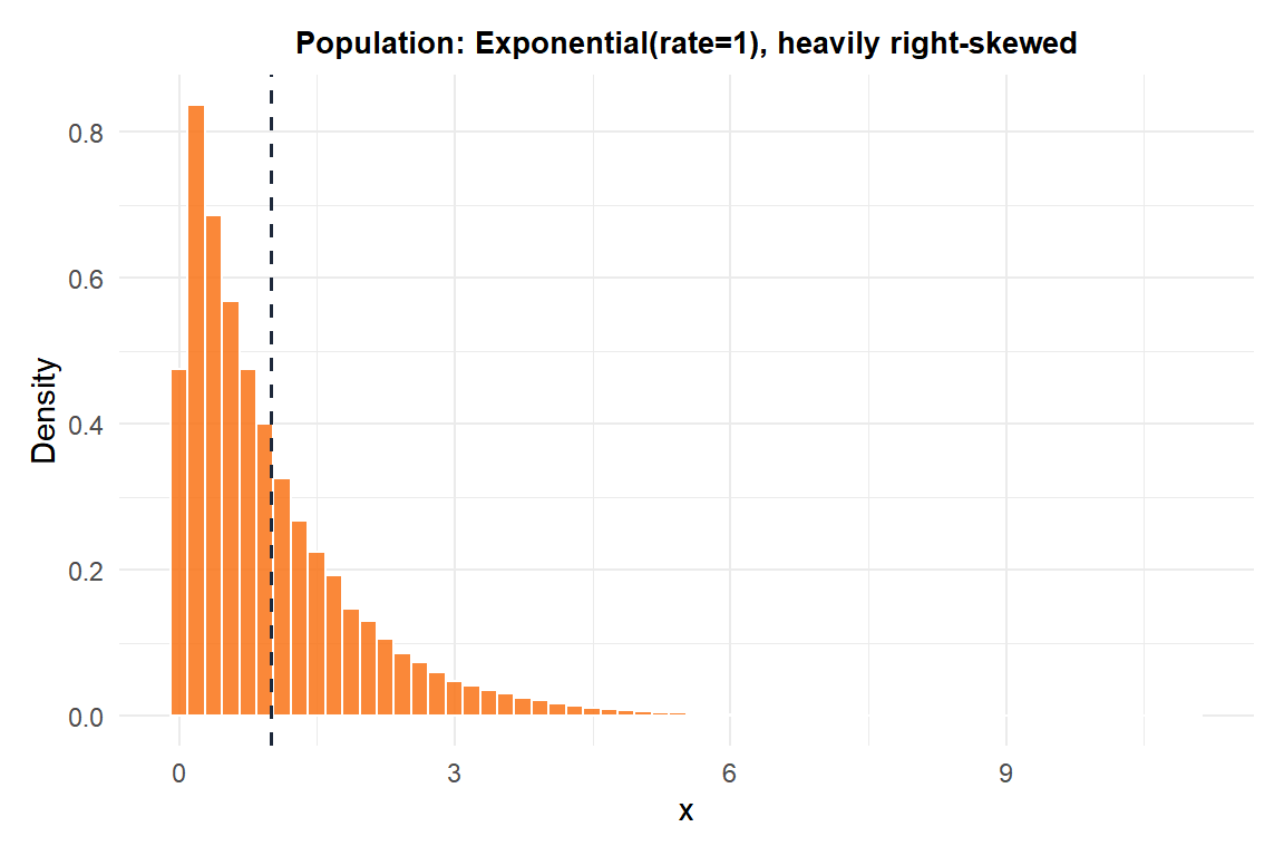
Now repeatedly draw samples of size \(n\) from this population, compute the mean of each sample, and look at the distribution of those means, the sampling distribution of \(\bar{X}_n\).
20,000 replicate sample means were simulated for each sample size \(n\) from Exponential(rate=1), with set.seed(123):
set.seed(123)
results <- sapply(c(2, 5, 30, 100), function(n) {
  means <- replicate(20000, mean(rexp(n, rate = 1)))
  c(mean = mean(means), sd = sd(means))
})| Sample size \(n\) | Mean of \(\bar{X}_n\) across 20,000 simulated samples | SD of \(\bar{X}_n\) (simulated) | Theoretical SE \(=\sigma/\sqrt{n}\) |
|---|---|---|---|
| 2 | 1.002 | 0.702 | 0.707 |
| 5 | 0.993 | 0.445 | 0.447 |
| 30 | 1.001 | 0.182 | 0.183 |
| 100 | 1.000 | 0.0989 | 0.100 |
Two things to notice. The simulated mean of \(\bar{X}_n\) stays essentially at \(\mu=1\) for every \(n\) (claim 2, no bias, even at \(n=2\)), while the simulated SD of \(\bar{X}_n\) shrinks and matches the theoretical \(\sigma/\sqrt{n}\) formula almost exactly at every single \(n\) (claim 3). What changes with \(n\) is only the shape of the distribution (claim 1): at \(n=2\), the sampling distribution of \(\bar{X}_2\) is still visibly right-skewed, inheriting the population’s skew; by \(n=30\) it already looks close to a symmetric bell curve; by \(n=100\) it is essentially indistinguishable from normal.

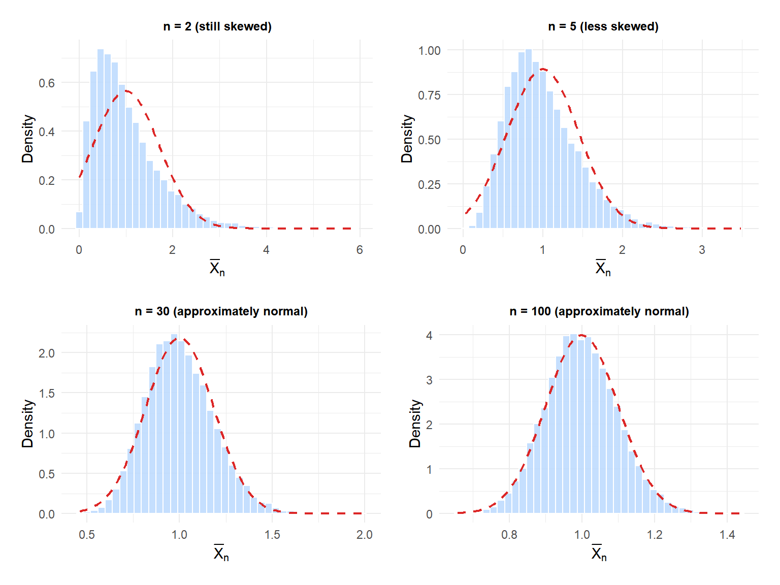
The blue histograms are the simulated sampling distributions of \(\bar{X}_n\); the dashed red line is the theoretical normal curve \(N(\mu, \sigma^2/n)\) the CLT predicts. At \(n=2\) the histogram still leans visibly to the right, away from the normal curve. By \(n=30\) and \(n=100\), the histogram and the theoretical normal curve are nearly on top of each other, even though the population they came from was never remotely normal.
Why this matters in practice
The CLT is the theoretical justification behind an enormous share of applied statistics on this site:
- The one-sample z-test and t-test for a mean rely on the sampling distribution of \(\bar{X}_n\) being approximately normal.
- Confidence intervals for a mean are built directly from the normal (or t) approximation to the sampling distribution of \(\bar{X}_n\).
- ANOVA’s robustness to mild non-normality comes from the same source: the test statistic is built from group means, and the CLT pulls those means toward normality even when the raw data are not normal.
None of these methods require the original data to be normal, only that the relevant statistic (typically a mean or a sum) is itself approximately normal, which the CLT guarantees for large enough \(n\).
⚠️ How large n needs to be depends on how skewed the population is
There is no universal cutoff like \(n \geq 30\) that works for every population (that number is a popular rule of thumb, not a mathematical guarantee). A population that is only mildly skewed may need just \(n=10\) or \(15\) for the sampling distribution of the mean to look convincingly normal. A population with extreme skew or very heavy tails (like the exponential example above, or worse, a Pareto or power-law distribution) can need \(n\) in the hundreds. Worse, if the population does not even have a finite variance (some heavy-tailed distributions), the CLT does not apply at all: no sample size will save you.
Always check: does the quantity you are averaging have a reasonably well-behaved, finite-variance population? If in serious doubt, use a nonparametric method or a bootstrap approach instead of leaning on the CLT.
Running the simulation in R
This reproduces the whole demonstration from scratch: draw from a heavily skewed population, then watch the sampling distribution of the mean tighten and normalize as \(n\) grows.
set.seed(123)

# Population: Exponential(rate = 1), mean = 1, sd = 1, heavily skewed
hist(rexp(100000, rate = 1), breaks = 60, main = "Population shape")

# Sampling distributions of the mean at increasing n
for (n in c(2, 5, 30, 100)) {
  means <- replicate(20000, mean(rexp(n, rate = 1)))
  cat("n =", n,
      " mean =", round(mean(means), 3),
      " sd =",   round(sd(means), 3),
      " theoretical SE =", round(1/sqrt(n), 3), "\n")
}
💡 The CLT is about the sampling distribution, not about your one dataset
A very common confusion: the CLT does not say your raw data will look normal if you just collect enough of it. Your raw data keeps whatever shape the population has, no matter how large your one sample gets. What becomes normal is the distribution of a summary statistic (typically the mean) computed across many repeated samples, or equivalently, the theoretical sampling distribution that a single sample mean is drawn from. If you plot a histogram of your raw observations and it still looks skewed even with a huge sample, that is completely expected and not a contradiction of the CLT at all.
For the closely related, but distinct, question of where \(\bar{X}_n\) ends up (rather than how it fluctuates around that point), see the Law of Large Numbers.